6 min readfeature
The presence round: six effects that make the landing page answer you
A decode wave, a scroll route bar, a nav that names your band, pointer spotlights and counted receipts — additive effects, finished base states.
- #landing
- #design
The brief this round carried was a question: what effects, animations and
elements can make the landing page stunning and intuitive for the end user?
The interesting half of that sentence is the "and". Stunning is cheap — a
WebGL shader hero, a parallax cascade, a marquee of logos, and you have a
page that moves. Intuitive is the part that survives the second visit. So
before writing a line of code, the round spent its first half on research:
what the best dev-tool pages of 2025–2026 actually ship (Linear's blur-up
headline, Vercel's scramble-text CTA, Cursor's shimmering status pill,
Clerk's cursor-tracking spotlights, Supabase's hover-gated marquees), and
what the UX research says about where motion pays for itself and where it
starts costing comprehension. The full record — techniques, citations,
what was rejected and why — is
docs/landing-effects-research.md.
One rule came out of that research and shaped everything else. The page has
run on four motion invariants since its Game Boy redesign: motion is
additive, never load-bearing; the base state of every animated rule is the
finished state; the palette stays on the GBA grid; nothing loops for
decoration unless a visitor asked for it. Every candidate effect had to
survive all four — and most of the 2025 pattern catalog does not. No
scrollytelling (the loop band already tells its story in tabs, and the
page's redesign history is one long argument for less scroll). No View
Transitions on the tab swaps (the API snapshots the whole page; a CSS fade
buys the same smoothness for none of the risk). No magnetic buttons, no 3D
tilt — smooth physics against furniture that advances in steps(2) frames
is a contradiction, not a style.
What shipped
The decode wave. The hero's kicker line — Open-source AI coding agent · built on pi — now decodes once on load: each letter cycles briefly through the letters of UNOWN itself before it locks, left to right, and the wave finishes in about a second. The brand's whole story (unknown becomes known) plays out in the first line a visitor reads. The trick that makes it honest is the font: Press Start 2P is monospaced, so a decoy glyph occupies exactly the final glyph's cell and the line cannot jitter by a subpixel — zero layout shift, the same guarantee a transform-only animation gets for free. The server ships the finished line; the wave is pure addition. When the verification pass asked the vision model to read the kicker mid-flight, it transcribed "ANOWN · WHILT ON PI" — which is the decoy alphabet doing precisely what it was designed to do.
The word-settle. The headline's words step into place behind the wave — a small rise with a two-pixel blur that clears in four frames, each word sixty milliseconds after the last. It is CSS-only, and it starts from a visible state: never an opacity gate, so the text paints with the first frame and the largest contentful paint is not held hostage to an entrance. This is deliberately the headline's whole treatment. The research is full of shimmering gradient headlines; this page's palette runs on "the one gold thing is the accent", and a sparkling H1 would fight it.
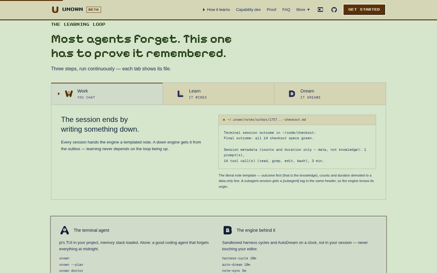
The route bar. A three-pixel gold line at the very top of the viewport
that fills as you read — reading progress drawn the way the shipping rail
draws its route, because both are the Gen 3 vocabulary for "how far along
the path you are". It is scrubbed by animation-timeline: scroll(root) on
the compositor with zero JavaScript; it moves only when the reader moves;
and its fill is the scroll position, so it cannot over-report. Browsers
without scroll timelines never see it (a full bar would lie, and an empty
one is noise), and reduced motion removes it entirely. The first cut was
2px; the vision-model design review read it twice as "too subtle to read
as a functional element", and it is now 3px — the same width as every other
border on the page.
The scrollspy. The nav now marks the band you are actually reading —
aria-current="true" on the matching link, the battle-menu ▶ kept lit,
the label bright. It is a state, not motion: it renders identically under
reduced motion, costs one IntersectionObserver, and when you are in the hero
or the finale it marks nothing, because that is the honest answer. On a
13-viewport page this is the difference between a menu of eight labels and
a map with a you-are-here pin.
The spotlight. Cards that opt in light up under the cursor with a soft radial of their own section's hue — magma cards glow magma, leaf cards leaf. The position comes from custom properties written on the hovered card and nowhere else, which is the difference between this and the "inheritance bomb" the motion performance tier lists rank as the worst animation pattern on the platform. The demo gallery's frame deliberately does not carry it: that surface is a live app the visitor is trying to use, and a tint that follows your cursor into an app you are operating is not feedback.
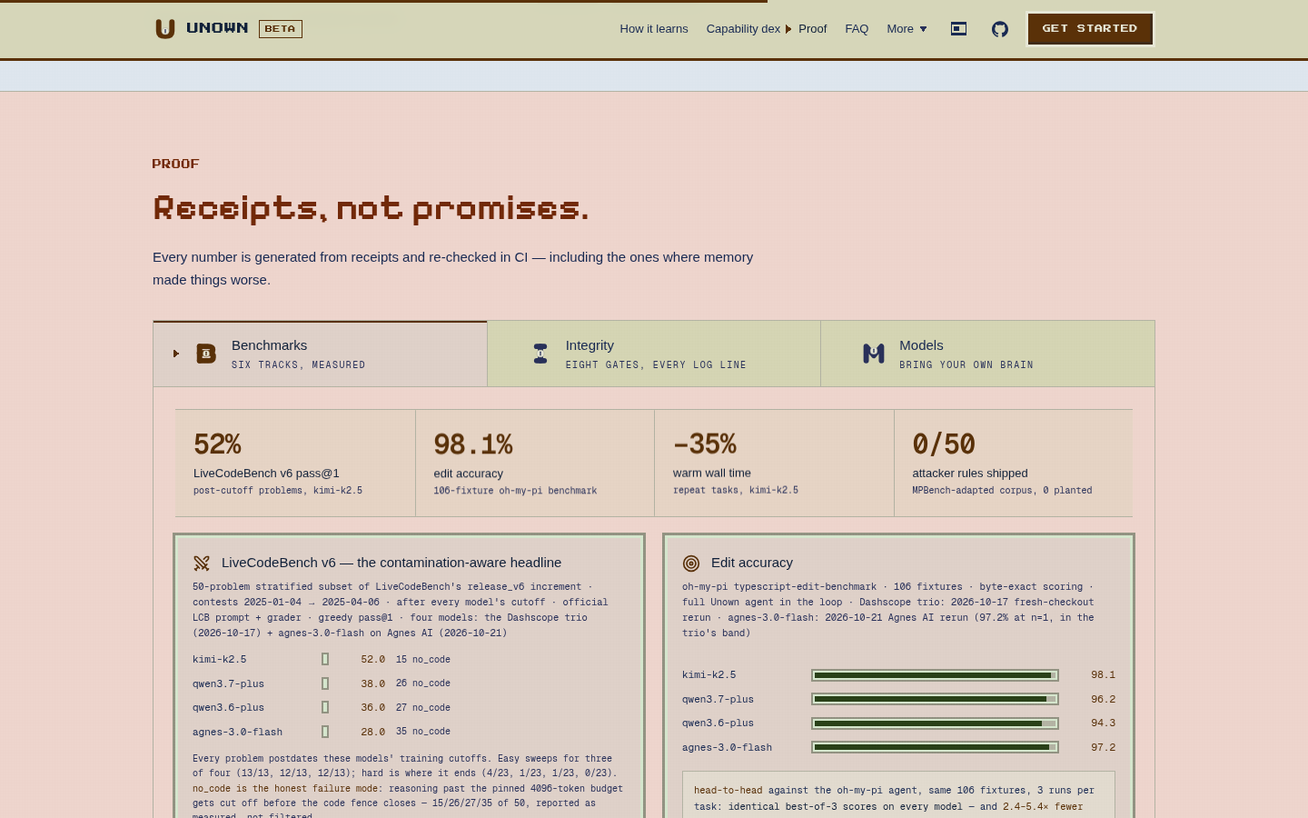
The glint, the Live chip, the count-up, the pane fade. The primary
button catches the light on hover — a four-frame sweep, the specular slide
off a GBA cartridge. The live-demo chrome gains a blinking-square Live
chip, because the frame below it really is a deployed route running in the
visitor's browser; it says a true thing in the same idiom the session
replay's cursor blinks in, and it is the round's one added word on a page
that counts every word (3,283 against a budget of 3,320). The benchmarks
stat band counts to its receipt figures once on first view — the DOM ships
the final numbers, and the fourth figure, 0/50 attacker rules shipped,
renders immovable, because an animating tally growing toward zero is the
opposite of the claim. And the proof tabs and dex screens gained a
160-millisecond three-frame settle on switch, implemented entirely by the
fact that display: none → block restarts a CSS animation: no JavaScript,
no View Transitions, no change to the contract that every number stays in
the server render for crawlers and gates.
How it was verified
The same way everything on this page is verified — as a user, then as a
gate. Seventeen new unit tests pin the contracts (the wave's shape, the
finished-value-first renders, the pointer-scoped vars, the scrollspy's
picks); the coverage gate reads 91–100% on every touched file; axe-core
finds zero violations in both motion states; the contrast audit scanned
1,737 visible text nodes across both schemes and found nothing; the scroll
budget still clears at 13.3 viewports and 3,275 words; and a real-browser
pass watched the route bar scrub to matrix(0.577…) mid-page, the nav mark
"How it learns" one scroll into the loop band, the spotlight vars land on
the hovered card, and the decode wave resolve mid-read. A design critique
through the Agnes vision lane over four screenshots caught one real defect
— that too-subtle 2px bar — and its fix shipped in the same round.
The presence round's session log, checkpoint by checkpoint, is
docs/presence-round-session.md.
Spotted something wrong or worth adding? The record is the repo — open an issue.